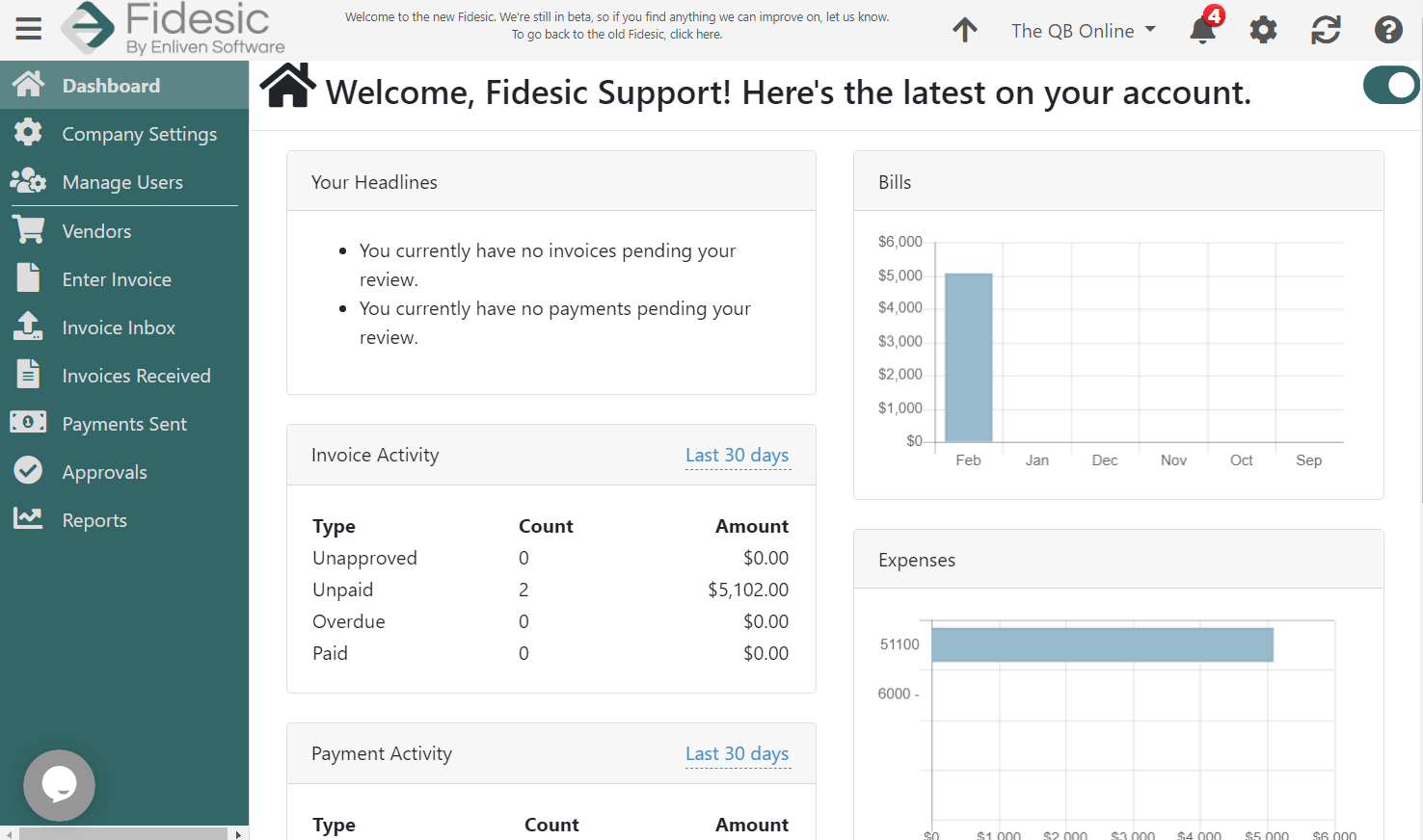
Fidesic 2.0 is Coming Soon!
Fidesic 2.0 beta is on it's way!
If you've been a long time user of Fidesic, you'll know that the platform has gradually added features, and continually improved over time. But this time we've got something totally different in store. For the past year we've been hard at work with a full revamp of our site. Fidesic 2.0 is a total redesign in usability and we're extremely excited to show you what we've done.
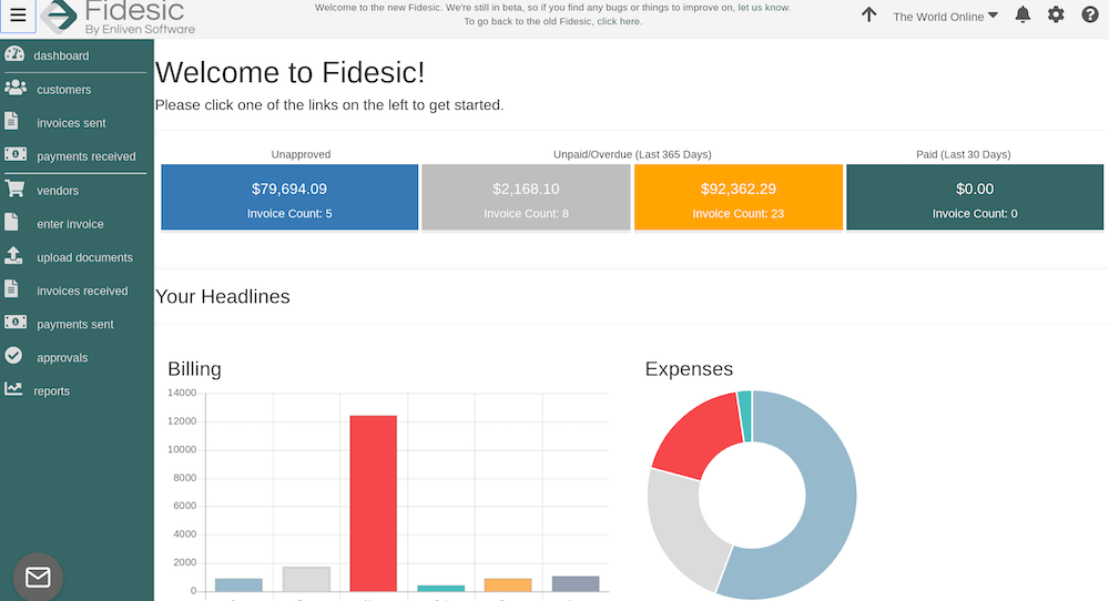
Vastly Improved Mobile Responsiveness
Fidesic 2.0 was designed with mobile devices in mind throughout the entire process. Whether you're using a tablet, phone, or chromebook, Fidesic 2.0 should be much easier to navigate on touch devices.
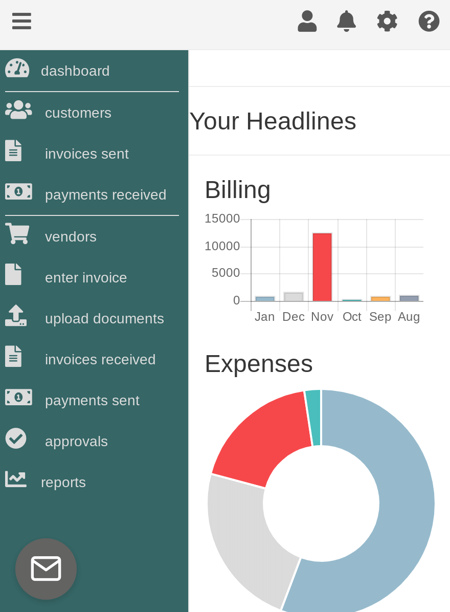
With 2.0 you'll have an even easier time approving invoices and payments on the go.
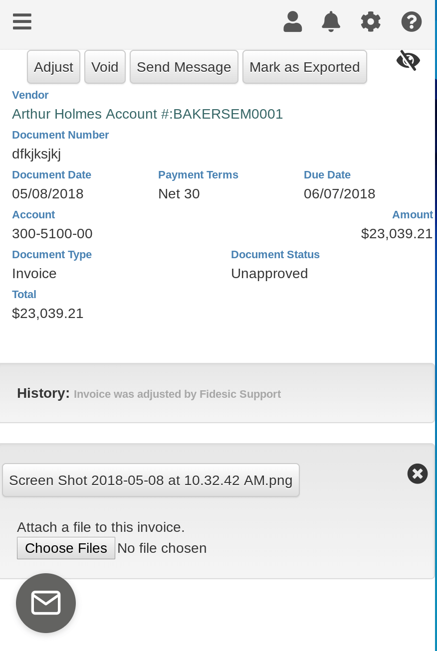
Vastly Improved Approval Workflow
Fidesic 2.0 gives you everything you need to approve an invoice all from a single page load. You'll have access to all invoice info, the original PDFs, all additional notes and attachments, a full invoice history, and it's current location it the approval process all at once.
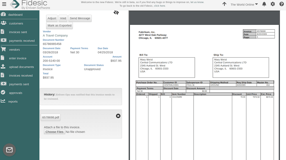
We also have added enhanced navigation the site which will allow you to quickly flip between invoices current in your approval queue, or any other queue.
Speed and Usability Enhancements
We're really just scratching the surface here in terms of enhancements, but the biggest feature will be general speed an usability. Fidesic 2.0 is now based on a modern code architecture, which from your perspective means improved page load speeds and compatibility. These improvements may seem minor and little nerdy but they will totally revolutionize the way you use the site.
We're extremely exited to release the new site in it's beta form this quarter. If you're interested in trying it in it's current beta form, please contact your Fidesic support representative and we'll get you logged in!

